 Back in late August, we had the opportunity to participate in a online Q&A with Disney storyboard artist and animator Burny Mattinson about his work on Sleeping Beauty. Burny joined the Disney company back in 1953 and has worked on a great many projects, most notably as director on both The Great Mouse Detective and Mickey’s Christmas Carol.
Q: You’ve worked in many unforgettable movies. Which is your favorite?
Burny: I have a very strong feeling for The Great Mouse Detective, beyond that Beauty and the Beast was one of my favorites to work on. Lady and the Tramp was my first film with the studio, and, of course, Sleeping Beauty has a very soft spot in my heart.
Q: When you were working on the film, did you have any sort of idea it would remain so popular 50 years later?
Burny: No! We were pleasantly surprised when everybody saw the final print and I think we all felt we made something classic. But at the time, we didn’t realize this would become such a beloved classic. We were too close to the working problems of it, just getting the work done. But then, when it was all together and we saw it for the first time, we realized we had something!
Q: What sort of problems did you encounter along the way?
Burny: There were problems all the time through the picture. Namely, it was a very slow process because we were trying to make it such a classic and we were using more abstract design elements which created a lot of problems. The very fact that we had to animate every frame instead of shooting each frame twice. If we didn’t the animation would strobe against Eyvind Earle’s backgrounds. We were working on three field paper and when you’re doing inbetweens on every drawing, you’re flipping back and forth with very wide paper which slowed the process down dramatically.
Q: What’s the one sequence in Sleeping Beauty you personally are the most proud of?
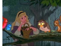 Burny: The first scene in Sequence 8 which was in the forest where Aurora was beginning to sing to the birds as she was picking the berries. That was actually the first scene that was animated in the film and I had to do it over four times. Once with her, once with the birds, and then we had to clean it up twice. Marc gave me a cake that said “Happy 31″ (which was the number of the scene) to celebrate that it finally went to color and Walt bought off on it!
Q: What’s your advice to a someone who dreams of becoming an animator?
Burny: Do lots of quick sketching. Watch people in restaurants or wherever, and just do quick drawings of their poses. Make them very expressive. I didn’t go to art school. I came to Disney with desire to draw. I drew all my life and, when I came to the studio, I was lucky enough to work with Marc Davis. He taught me so much, but I would encourage anyone to focus on getting as much art education as you possibly can get.
Q: When you create a character, there are a number of preliminary designs from which to choose. Can you tell us about the “elimination” process? How do you pick the final design and who has the final say?
Burny: In this case, Walt had the last word on the design. As it passed between different designers and Marc Davis, it afforded them a chance to take a little bit of everybody’s design and mix it together. But Walt made the last decision on each character and every aspect of the picture. He wouldn’t let anything go unless he saw it and that’s why it took so long to make this picture, especially since he was so involved with Disneyland at the time.
Q: How much of Maleficent’s onscreen personality comes from Eleanor Audley’s rich vocal performance and how much is classic Marc Davis?
Burny: I’d say 60% of it was Eleanor’s and Marc followed up with the rest of it! He was highly influenced by her. She set the tone for how the character should act.
 Q: What design features make Maleficient a great villain?
Burny: The head-dress certainly made a strong statement; her height overpowering the frame, and her bombastic acting where she would keep everything controlled and then suddenly explode. That created a strong character.
Q: What was the deciding factor for the final look of her character?
Burny: Marc made a variety of designs to show Walt and he made the choice going with the horns and so forth. Marc spent a lot of time with his designs and with Eyvind, which is why he made her such an elongated figure, to work with Eyvind’s horizontal and vertical backgrounds.
Q: What made Maleficient so different from previous Disney villains?
Burny: One thing that got me was her reaction at not being invited to the party. It was a bit over the top, which is pretty darn cruel for no reason.
Q: Can you see any elements of Maleficent in subsequent Disney villains?
Burny: Cruella was also designed by Marc Davis and the voice was Betty Lou Gerson. She was a classic radio actress and had the same things that Eleanor had in her voice. Marc really had a lot of fun with that character. She was bombastic all the time. Every animator loves to have a character move; not be very stilted. Again, Marc wanted a more controlled character in Maleficent with very little movement. He wanted to save her movement for shock value when she suddenly explodes.
 Q: Sleeping Beauty is one of the only Disney animated films where the hero takes out the villain himself, while most other Disney villains meet their end indirectly. Did you have to fight at all to use that ending?
Burny: No, I don’t believe we did. We needed to resolve Maleficent in some manner. Certainly she imprisoned Phillip and caused Sleeping Beauty to go to sleep. The only one that could undo it was the Prince. There was no one else except the faeries and they couldn’t use their magic against her. That was a strong story decision.
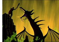
Q: Maleficent metamorphosing into the dragon was one of the earliest sequences to use the Xerography process. What was your experience of the change in animation?
Burny: Woolie Reitherman directed the dragon fight sequence and he did use the Xerox process for the first time on the dragon. I think they went back over the Xerox line with ink & paint, but he did use the process as an experiment for enlarging and reducing her in the frame. That was actually the start of Disney using Xerox in animation. It was a very crude process. We used an omega 8×10 enlarger as our camera and had these old aluminum inking boards coated with the Xerox material. It was very crude, but by the next picture, 101 Dalmatians, we had a first class Xerography operation.
Q: How many animated features did Walt have in development at any given time? Were there any that didn’t get made you would have loved to be a part of?
Burny: About 1940, Walt was starting to do four features at one time (Pinocchio, Bambi, Fantasia, and Dumbo) and they were all in work status. At the same time, he had stories that were in development like Cinderella and Peter Pan which hit a wall because of the War, so they were put on the shelf and revisited later. Walt was so disappointed in Pinocchio and Fantasia not doing as well as they should — because the overseas market disappeared during World War II — that he was going to go on a long vacation. Someone sent a little series of pictures of an elephant character and he gave it to Joe Grant and said “See what you can do with it.” So, Joe and Dick Humor developed the story of Dumbo while Walt was away, which was done very fast because it was so simple and it turned out to be very successful.
Q: What is your favorite Disney feature you didn’t work on?
Burny: Pinocchio. I wasn’t able to work on it since I was just a little kid, but it had the biggest impact on me, because it’s why I wanted to work here at Disney.
 Q: Is there a story or a fairy tale you would really love to adapt or see adapted as an animated feature?
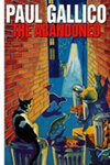
Burny: Paul Gallico’s The Abandoned. In fact, the studio owns the book and many of Walt’s Nine Old Men went to him and said this is a story they really wanted to do. This was the one picture that got away from them.
Q: How has animation at Disney changed since Sleeping Beauty?
Burny: When we first worked on Sleeping Beauty, we were trying to do a more classic approach to our animation; to be more exacting in the design. We were learning to use our “straights” against “curves,” to fit within Eyvind Earle’s stylized backgrounds. This was a slow process. Later on, we went to a looser approach on 101 Dalmatians, where we could speed up the process but were also trying to get back into the classic style of animation. Even today, we still try to keep a classic approach. Perhaps not as designed as on Sleeping Beauty, but still classic in our approach to contemporary titles.
 Q: What’s the one thing you think nobody notices in Sleeping Beauty that they should pay attention to?
Burny: Watch the beautiful backgrounds. The animation is so well done, especially the faeries when they’re miniature. The restored aspect ratio now includes so much more imagery than has ever been seen before and the forest sequences are fantastic in Blu-ray.
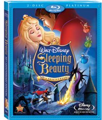
Q: The Blu-ray presentation of Sleeping Beauty is marvelous. Is high definition worrisome to animators, since now even the smallest design flaws may become much more apparent?
Burny: No, I think quite the contrary. We want to see the image as beautiful as it was originally intended to be. Blu-ray — I love it!
0 comments ↓
There are no comments yet...Kick things off by filling out the form below.
Leave a Comment